This may seem obvious, but it bears repeating: the community resource directory data problem is complex, and complex things can be hard to understand.
During my work as lead organizer of the DC Open211 project, I’ve seen that there are so many people out there who want to find better ways to produce and share this information. However, to really make a difference, we need to be able to work together — and in order to work together, we need to share some common understanding of what we’re working with!
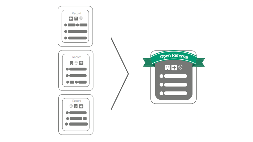
So we’ve developed a set of icons to convey the key elements of this complex topic in ways that can be understood at a glance.
Check it out:
Download a PDF here, and EPS files here.
(This content is licensed by Open Referral as Creative Commons, CC-BY-SA 4.0)
This is just a first draft (and we’d welcome your efforts to improve it!). It has already helped us bring stakeholders with different technical capacities together around a table, keeping things relatively clear when the conversation turns to topics like, for example, “Application Programming Interfaces.” (An API is like a robot that moves data on command!) In the future, we hope to see this visual vocabulary used for anything from presentations to planning sessions.
Do you see better ways to convey these ideas? Or are there concepts that aren’t included here, but which seem important to you? Let us know!


Leave a Reply